National Theatre Typography
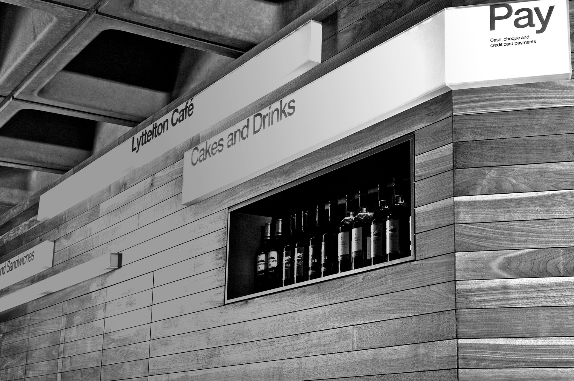
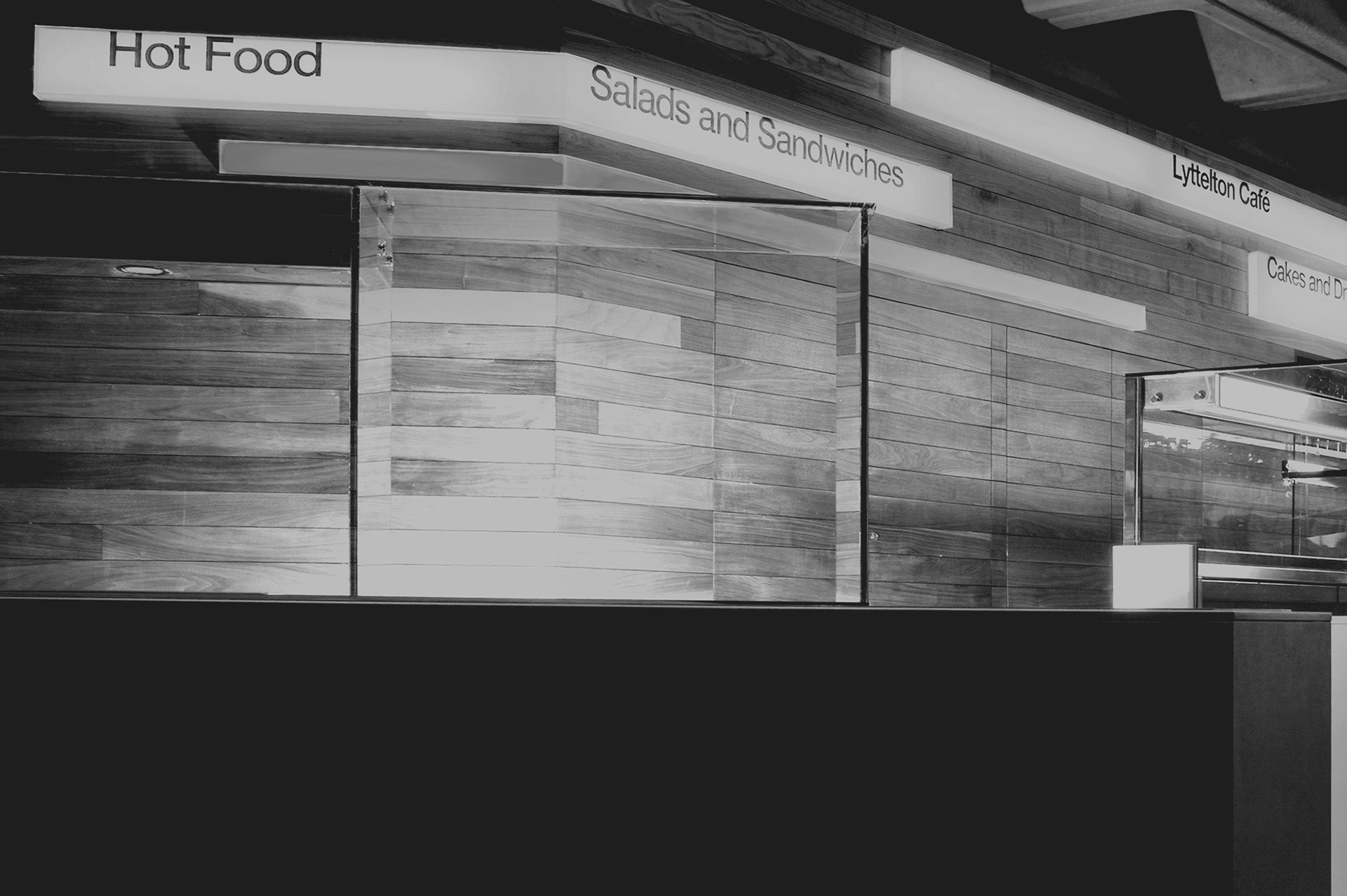
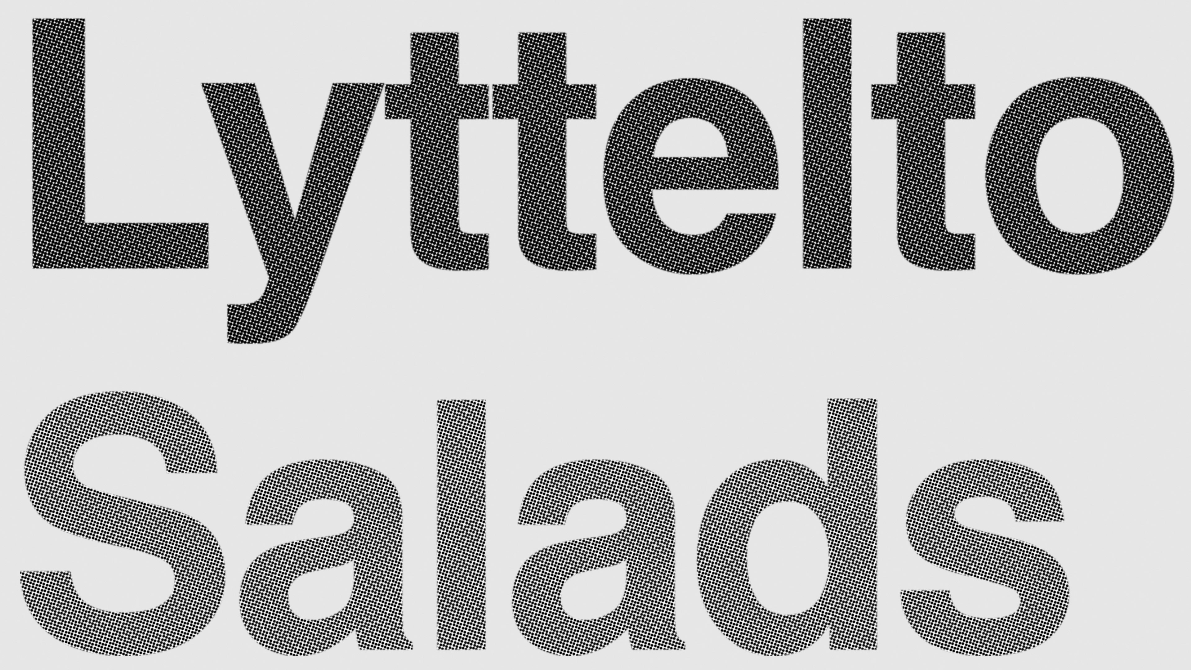
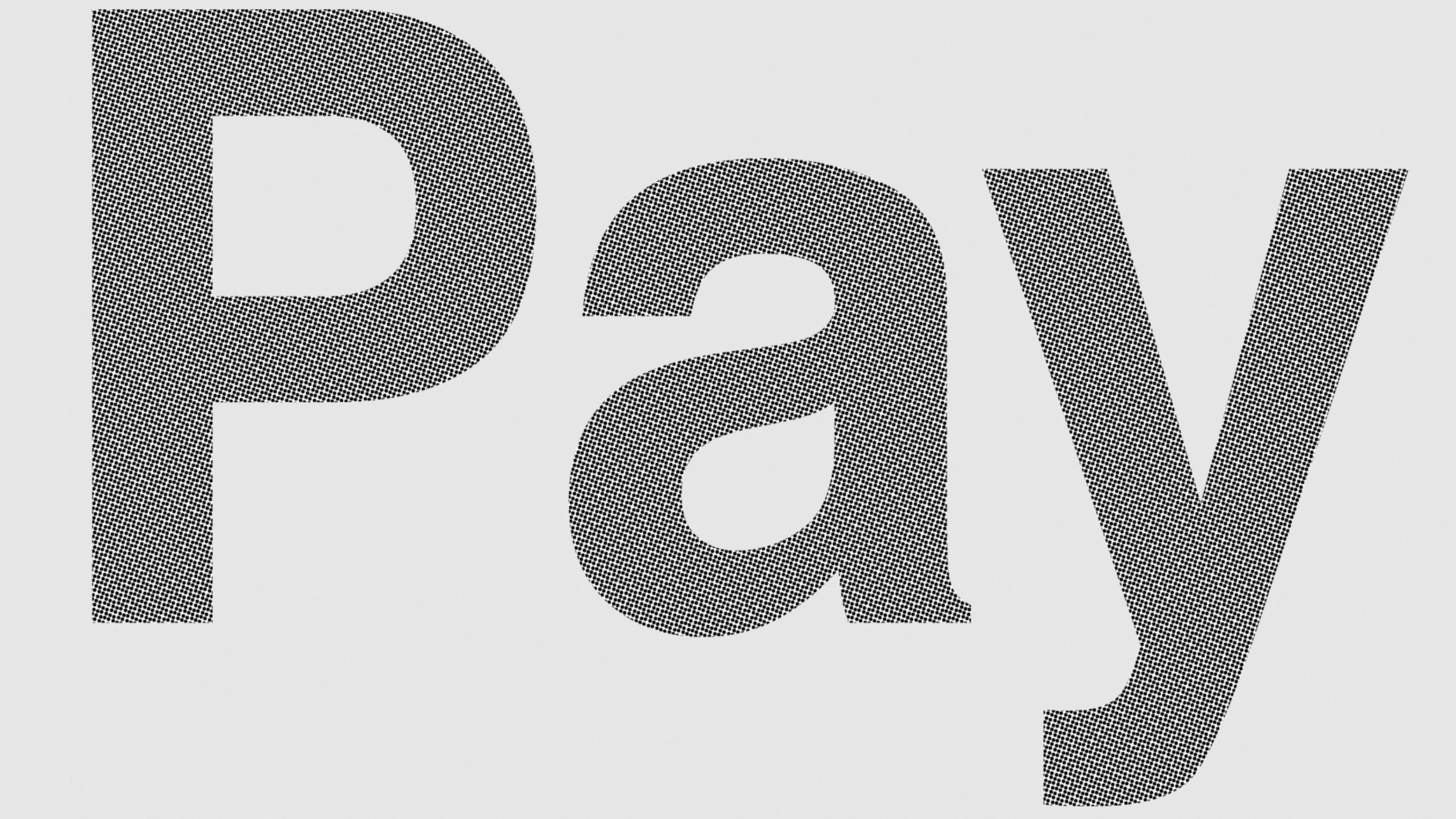
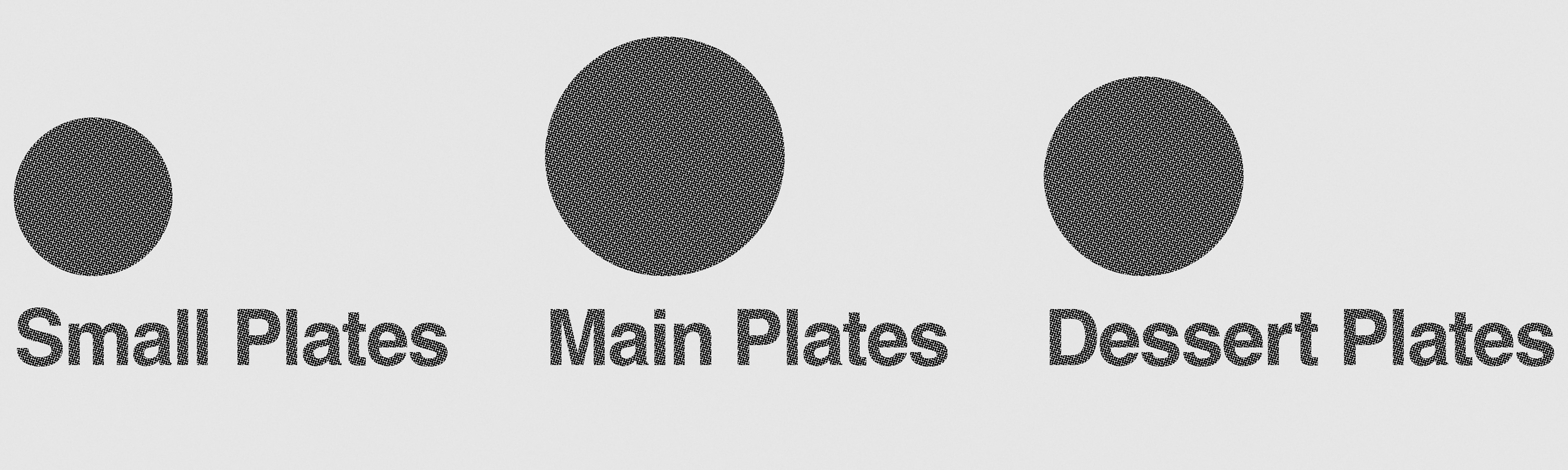
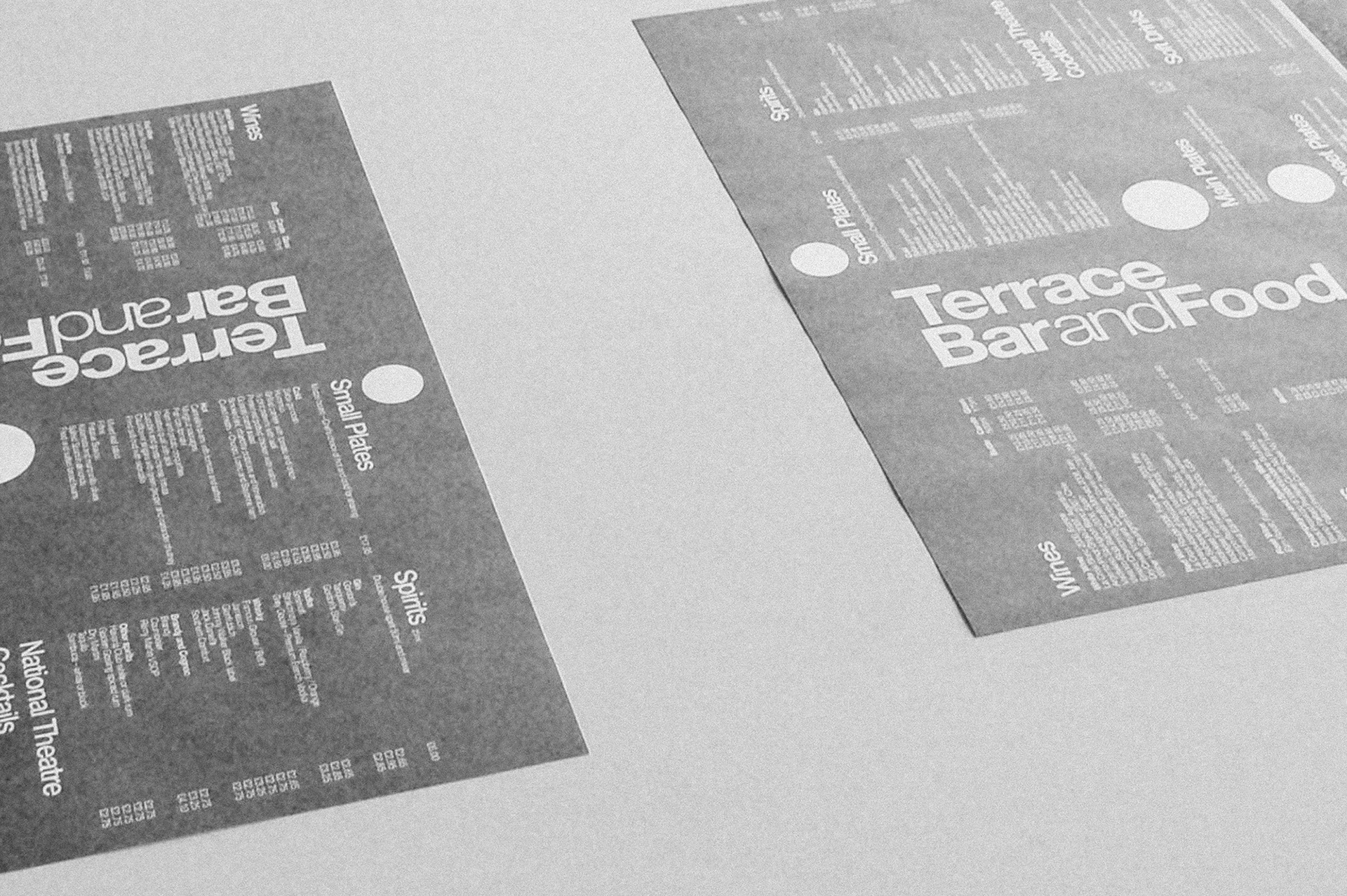
A typographic scheme developed to brand the theatre's catering spaces following the redesign of the Lyttelton Café, Espresso Bar and Terrace Bar. A tonal version of the theatre’s Helvetica font forms a signage hierarchy within the spaces that is easily legible within the buildings often complicated architecture. A series of halftone patterns were developed that allow the letterforms to be screen printed onto illuminated surface without discolouration or shading. The typography is applied to way-finding, menus and labelling.
Role. Design
Client. National Theatre
Agency. HStudio
Client. National Theatre
Agency. HStudio